The Poster That Says Almost Nothing
Image generators get text wrong because they paint letter-shaped pixels rather than spell words, so set longer text yourself. If you need a word or two on a sign, pick one of the newer models and proofread the result. For brand names, prices, or body copy, generate the image without text and add the words in a design tool.
You describe a coffee shop poster reading “Fresh Roast Daily” and the model returns something beautiful. The lighting is right, the composition is right, and the sign reads “Fresh Roost Dally” in a font that mutates halfway through the second word.
Everyone who uses these tools hits this wall, usually within the first hour. It looks like a bug that a patch should fix, and it is not.
The behaviour comes from how image models were built. Understanding that takes ten minutes and saves you from a week of prompt experiments that cannot succeed.
The Short Answer
Most image generators do not write letters. They paint regions of an image that look like letters, based on millions of examples where text appeared as visual texture rather than as characters with fixed meaning.
Nothing in that process enforces spelling. The model has no separate representation saying that “roast” is five specific glyphs in a specific order, so it reproduces the look of the word and improvises the details.
The practical consequence is simple. Short text has become reliable enough for drafts in the better models, and anything longer than a headline belongs in a design tool.
How a Model Sees a Letter
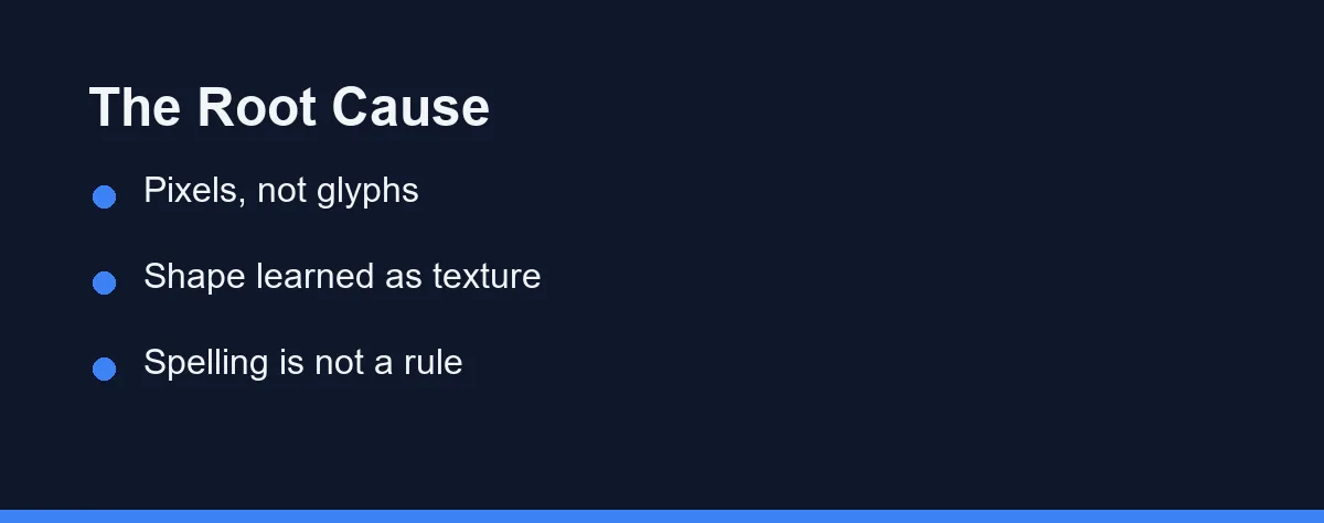
A diffusion model turns noise into an image, step by step, guided by a text encoder that converts your prompt into numbers. Those numbers capture meaning well and character-level detail poorly.
Add to that how prompts get chopped up. Text is split into tokens that often bundle several characters together, so the exact letter sequence inside a word is not something the model reliably carries through to the canvas.
The image side has the same gap. Nothing in the training objective rewards the model for spelling correctly, only for producing pixels that look like the kind of image the prompt describes.
So a sign in the output is a picture of a sign. It carries the visual rhythm of English text, which is why the errors so often look like plausible words from a language nobody speaks.
Why Newer Models Suddenly Got Better
The improvement over the past couple of years is real, and it came from deliberate engineering rather than scale alone. Several teams began treating typography as a target instead of a side effect.
Larger and more character-aware text encoders help the model retain the exact string you asked for. Training data with clean, labelled text teaches it what correctly rendered words look like across fonts and surfaces.
Products differ in how far they took this. Ideogram made legible text a headline feature, and recent versions of the major general-purpose generators handle short phrases far better than their predecessors did.
The gains concentrate in one place. A three-word headline in a clear font now often lands, while a paragraph of body copy still dissolves into texture.
That pattern tells you something useful about the underlying fix. The models did not learn to spell in any general sense, they learned to reproduce short strings more faithfully.
So the improvement scales with how much text the model must hold steady at once. Every extra word is another chance for the reconstruction to drift, which is why quality drops off a cliff rather than degrading gently.
Expect this ceiling to keep rising and expect the shape of the problem to stay the same. Short and prominent will keep working before long and small does.
Where Text Still Falls Apart
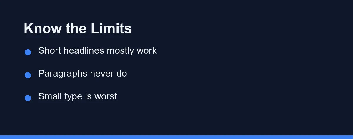
The failure rate scales with everything that makes text demanding: length, size, font specificity, and how many separate text elements share the frame.
| Text situation | Typical result today | Safe to ship |
|---|---|---|
| One or two words, large, simple font | Usually correct in the better models | With a proofread |
| Short headline, three to five words | Often correct, occasional letter errors | With a proofread |
| Brand name in a specific typeface | Shape approximated, rarely exact | No |
| Full sentence on a sign or poster | Frequent errors, drifting letterforms | No |
| Paragraph of body text | Reliably nonsense at small sizes | No |
| Multiple text blocks in one image | Errors multiply across blocks | No |
| Non-Latin scripts | Weakest area across most models | No |
| Numbers, prices, dates | Plausible-looking and often wrong | No |
The last row deserves particular attention. A wrong number looks exactly as convincing as a right one, and nobody proofreads a price the way they proofread a headline.
Non-Latin scripts remain the widest gap. Training data skews heavily toward English, and models that manage a clean English headline can produce unreadable output in scripts with different letterforms.
Prompt Habits That Genuinely Help
Put the exact wording in quotation marks. It costs nothing and it measurably improves the odds, because it marks which characters matter rather than leaving them buried in a description.
Cut the word count before you cut anything else. Two words on a sign will succeed where seven will not, and shortening the copy is usually easier than fighting the renderer. Google’s own Imagen 3 prompt guide advises limiting text to 25 characters or less and using no more than three phrases.
Describe the surface as well as the words. A prompt that specifies a clean flat sign gives the model an easier canvas than one implying a curved, textured, or dimly lit surface.
Generate several options and pick, rather than iterating on one. Spelling success varies between runs even at identical settings, so a batch of four gives you a usable candidate faster than four rounds of prompt surgery.
The Route Most Working Designers Take
Ask a designer how they handle this and the answer is almost never a prompt trick. They generate the image without text and set the type themselves.
The reasoning is practical rather than purist. Real type gives exact spelling, the client’s actual font, alignment you can control, and a change that takes ten seconds when the copy is revised.
It also survives contact with the real world. A logo, a price, or a legal line has to be correct, and a workflow that depends on a model guessing right is not a workflow you can promise a deadline on.
Ask for negative space when you generate. A background with an empty area, a blank sign, or an uncluttered wall gives you somewhere to place text without fighting the composition.
The Check That Takes Two Minutes
Generated text fails in ways that slip past a normal glance, so it needs a deliberate pass rather than a quick look.
Read the words backwards, one at a time. It sounds fussy and it works, because reading forwards lets your brain autocorrect a misspelling into the word you expected.
Zoom to full size before approving anything. Errors hide at thumbnail scale, and the thumbnail is exactly how you review an image inside a chat window.
Check every number separately from every word. Prices, dates, and quantities carry the most risk and attract the least scrutiny, which is a bad combination on anything public.
Then ask a second person to read it cold. Whoever wrote the prompt is the worst proofreader for that image, because they know what the sign is supposed to say.
What Each Approach Actually Costs
Generating text inside the image costs you accuracy and control. It buys speed, and it works when nobody will read the words closely, such as in mood boards and rough concepts.
Compositing text afterwards costs you a design tool and a few minutes of setup. It buys correctness, editability, and the ability to hand the file to someone else.
There is a middle path that suits social content. Generate the image, then use the text tools inside the same platform or a lightweight editor, which keeps everything in one place without leaving spelling to chance.
Cost in money rarely decides this. Both routes are available on free tiers of common tools, and paid API generation is cheap, with Google listing Gemini 2.5 Flash Image at $0.039 per image as of September 2026. The deciding factor is whether an error would embarrass you.
Which Approach Fits Your Project
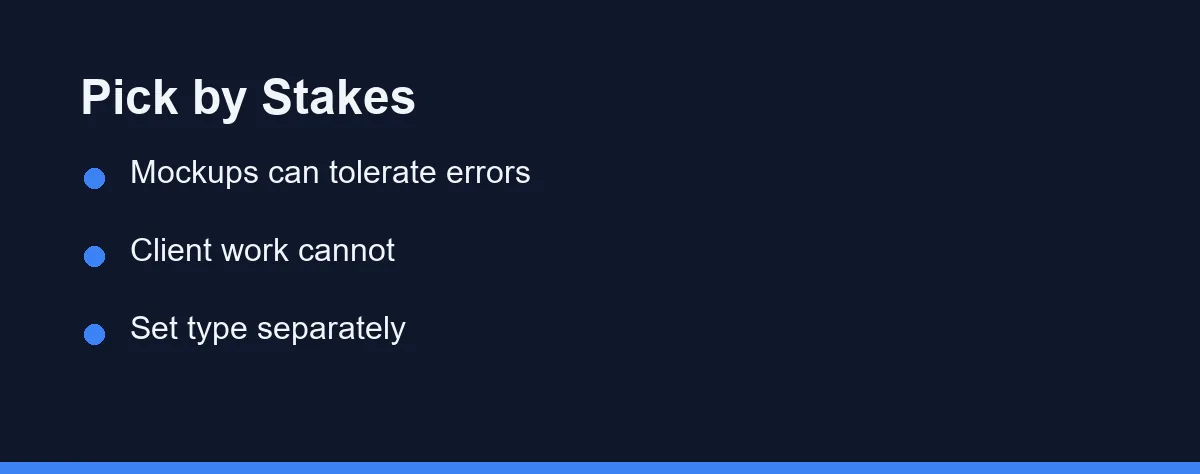
The founder making a quick mockup for an internal deck: Let the model try. Errors are tolerable at concept stage, and the speed is the entire point.
The designer producing client work: Generate imagery only, set every word in your design tool. Nothing that carries a brand name should depend on a probabilistic renderer.
The social media manager posting daily: Generate a clean background with deliberate empty space, then add text in your scheduling or design tool. This is the fastest reliable loop for volume work.
The seller making product listing images: Set text separately, always. Prices, sizes, and claims on a listing image have consequences when they are wrong.
The blogger making header images: Either route works if the header carries no words. When it must carry the article title, add it afterwards so you can reuse the background later.
Anyone working in a non-Latin script: Assume the model cannot do it and plan a separate text layer from the start. This is the one case where the recent improvements have barely arrived.
Design Around the Limit, Not Against It
The spelling problem is a consequence of how these systems work, not a defect waiting for a patch. It is shrinking for short text and will keep shrinking, and it has not disappeared.
The workflow that ages well treats imagery and typography as separate jobs. That was already how design worked before any of these tools existed.
If you are still choosing a generator, our roundup of AI image generators covers the wider trade-offs. Our comparison of Midjourney, DALL-E, and Stable Diffusion goes deeper on the three most common choices.
The same reasoning explains a related frustration, where a run you liked refuses to come back. Both trace to the noise the model starts from, and what a seed actually controls sets out why repeating a result is harder than it looks.
Book covers are where the text problem costs the most, because the title has to read at thumbnail size. Our guide to putting an AI-generated cover on an Amazon KDP book covers setting that type yourself and what Amazon asks you to disclose.
FAQ
Why do AI image generators spell words wrong?
Most image models paint pixels rather than place letters. They learn what text looks like as a visual texture, not as a sequence of characters with fixed shapes. A word is therefore reconstructed by appearance, which produces letters that look right individually and collapse into nonsense as a string.
Which AI image generators handle text best?
Models built with typography as a stated priority do noticeably better on short phrases, and Ideogram is the clearest example. Recent versions of the major general-purpose generators have also improved on headline-length text. All of them still degrade as the word count rises.
Does writing the text in quotation marks in the prompt help?
It helps, and it is the single cheapest thing to try. Quoted text signals which characters matter and gives the model a clean target. It does not fix long strings, small type, or unusual fonts, so treat it as an improvement rather than a solution.
Is it better to add text in a design tool afterwards?
For anything that must be correct, yes. Generating a clean background and setting the type in a design tool gives you exact spelling, real fonts, and edits that take seconds. Most working designers use the model for imagery and never for the words.
Will this problem disappear in the next generation of models?
It is improving quickly, and short headline text is already usable in several products. Long paragraphs, small captions, and precise brand typography remain unreliable, so building a workflow that assumes the text layer is separate is still the safer bet.
Sources
- Google Cloud: Imagen prompt and image attribute guide — checked 2026-09-27
- Google AI for Developers: Gemini API pricing — checked 2026-09-27
Some links may be affiliate links. We may earn a commission at no extra cost to you.
This article was written with AI assistance. It is researched and fact-checked, not based on personal hands-on testing unless explicitly stated.
Comments
Post a Comment